
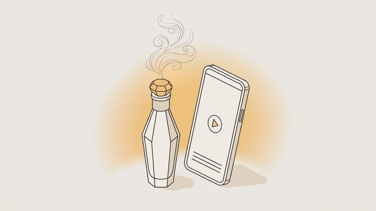
Key takeaways: Perfume backgrounds for design help show the bottle with a clear mood before any text is written, when size, colour and empty space match the scent family and placement. A background is chosen in a vertical or square size by placement, with no real brand bottles or logos, and it can start a still image or a short video.
What size should perfume backgrounds for design be for Stories and Reels versus a square post?
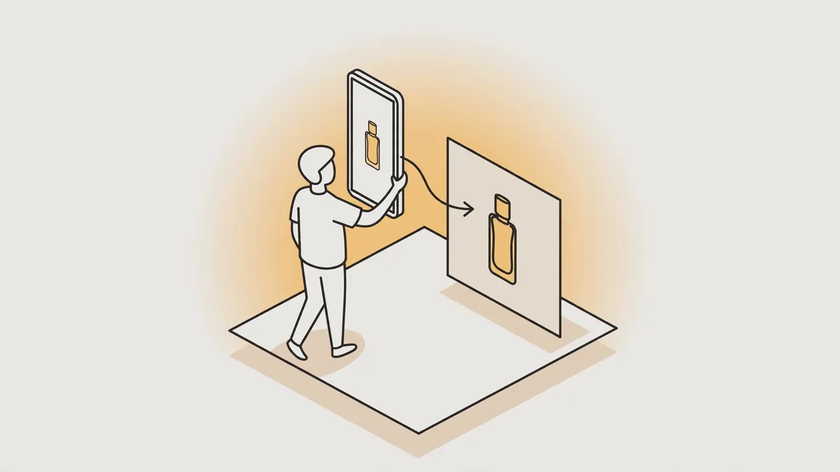
Choose vertical perfume backgrounds for design at 9:16 for Stories and Reels so the bottle fills the screen without cropping, and a square 1:1 version for a post so it stays clear inside the frame. Prepare both from the same design, leave calm space for text, and keep the product name away from edges.
Stories and Reels
- Background shape
- Tall vertical that fills the screen
- Design priority
- Fully visible bottle with calm upper and lower space for text and the call to action
Post
- Background shape
- Square balanced around the centre
- Design priority
- Relatively larger bottle and label in the centre without cropping the cap
Product launch
- Background shape
- Vertical, then a square version of the same design
- Design priority
- One mood and one message with framing as the only difference
Gift offer
- Background shape
- Square or vertical by placement location
- Design priority
- Clear space near the bottle for the occasion name or a short gift message
Store product image
- Background shape
- Calm with few details
- Design priority
- Bottle alone in the centre with side space for short details when needed
For the effect of framing differences between sizes, see video sizes 9:16, 1:1 and 16:9.
How to Choose the Perfect Background for Your Perfume Photoshoot?
Choose the background from the scent family before colour alone, because oud and incense suit dark depth with wood and smoke, musk suits clean light and pale silk, and rose florals suit a soft gradient that does not compete with the bottle. Let the background suggest the leading note, then test it small before final approval.
Oud and incense
- Suggested background
- Dark smoke with majlis wood
- Visual cue
- Quiet depth, warmth and mystery
Clean musk
- Suggested background
- Pale silk with water ripples
- Visual cue
- Purity, lightness and a fresh feeling
Rose and florals
- Suggested background
- Soft petals on a calm gradient
- Visual cue
- Gentleness and elegance without crowding around the bottle
Amber and luxury
- Suggested background
- Black marble with a gold touch
- Visual cue
- Formal presence suited to launches and gifts
Desert mood
- Suggested background
- Dunes at dusk with a long shadow
- Visual cue
- Breadth and warmth suited to occasions
Soft romance
- Suggested background
- Pale flowers with light feathers away from the bottle
- Visual cue
- Visible gentleness without hiding the bottle or its label
When writing text over the background, choose a phrase that suits the same family from perfume marketing phrases.
Where should you place the bottle and text on a busy ready background?
Place the bottle in a calm area of the background and leave clear space around it that separates it from smoke, marble and decoration, then put text on a flatter area with few details. Keep the label straight, sharp and readable, and do not cover the cap, neck or product name with shadow or ornament.
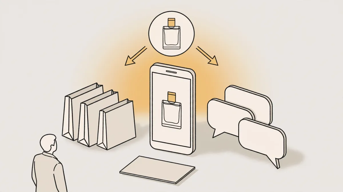
- Choose the calmest spot in the background and make it the main bottle position.
- Place the bottle near the centre, or on one side balanced by space reserved for text.
- Leave a margin around the cap and base so the product does not touch the design edge.
- Place the headline on a flat area and keep the call to action line separate from decoration.
- View the design at a small phone size and check that the product name is still readable.
- Move the text before changing the whole background, because rebalancing is often enough.
How do you choose a background that shows oud and incense smoke clearly?
Incense and oud smoke backgrounds read clearest on a calm dark gradient, with soft side light that separates the bottle edges from the background and leaves the smoke one path that does not cover the label. Reduce decoration near the bottle and keep smoke behind it or around its base, so the product remains the clearest point.
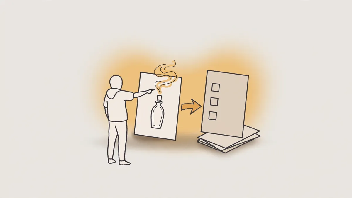
- A dark gradient background with no bright patches directly behind the label.
- Soft side lighting that draws the glass and cap edges with quiet clarity.
- Light smoke behind the bottle or at its base only.
- A simple surface under the bottle that reflects light without competing with the product.
- Avoid dense white smoke in front of pale glass so the edges do not disappear.
- A final greyscale test to confirm the overall shape contrast.
Can I use a free background in a commercial store ad?
Do not assume a free background is valid for a commercial ad just because it can be downloaded, because usage rights differ by source and terms. Check permission for commercial use, editing and ad placement, keep the source name, terms and access date, and choose an original background or a clearer alternative when in doubt.
- The permitted use type, and whether it includes paid commercial ads or personal display only.
- The right to crop the background, change its colour and add a bottle and text over it.
- The right to publish the final design in multiple locations, and any duration or limits stated in the terms.
- Any requirement to credit the source, add a link or preserve a particular mark.
- Any ban on redistributing the original background alone or selling it to others.
- Keeping the source name and a copy of the terms page from the access day.
For ownership and extra version questions before reuse, see ownership of an AI made ad.
How do I keep one background style across all my store ads?
Unify store ad backgrounds with a limited repeating colour palette, such as black and gold for luxury or pale silk tones for purity, plus a fixed method for bottle placement, lighting and text. Unifying does not mean repeating the same image, but repeating mood, edges and space so viewers recognise the store quickly.
Colour palette
- What stays fixed
- Limited core shades repeated in every ad
- What can change
- A supporting shade by scent family or occasion
Background material
- What stays fixed
- One family such as marble and gold or wood and smoke
- What can change
- The piece best suited to each product within the same family
Bottle position
- What stays fixed
- Fixed height, similar size and always exposed label
- What can change
- Bottle side when needed to balance text
Text style
- What stays fixed
- Similar position, clear contrast and limited line count
- What can change
- Occasion words or the scent family name
Lighting and smoke
- What stays fixed
- Similar light direction and smoke that never covers the label
- What can change
- Light strength by bottle colour and background shade
How do you turn a still background into a short perfume video ad?
Turn a still background into a short video with slow deliberate movement, such as a slight move toward the bottle, smoke flowing behind it, or a light gleam passing across the glass, then add a clear opening, short text and one call to action. Keep the label stable and test the version without sound before final publishing.
- Start with the still background and the bottle in its final position without movement.
- Add a slow approach or slight side shift that keeps the label clear.
- Move smoke, a light gleam or water ripples behind the product only.
- Put a short opening with the product name or occasion, then one concise benefit.
- End with one call to action and leave a final still frame long enough to read the name.
- Review the movement frame by frame to confirm that the glass, cap and name have not distorted.
For a full production sequence from idea to publishing and testing, see steps to make an AI video ad.
How can you try this on your product?
Request a free sample video before any payment. Product photos and a store link are enough, with no sample shipping, and the first batch arrives 48 to 72 hours after script approval, in 9:16 for Meta, TikTok, Snapchat and YouTube Shorts.
Frequently asked questions
What does a perfume shoot cover? It covers choosing a background that suits the scent family, adjusting lighting and contrast, placing the bottle and label clearly, leaving space for text, then checking size and phone readability before publishing.
What are the essential design elements for a fragrance ad? The essentials are a sharp bottle and readable label, a background that suggests the scent without crowding, lighting that separates glass from the background, calm text space, and one clear call to action at the end of the design.
Does a dark background suit every perfume? No. Dark backgrounds usually suit oud, amber and evening moods, while clean daytime perfumes usually need lighter, less decorated backgrounds so the intended sense of lightness and freshness appears.
Should I use the same background for every product in my store? The better approach is to unify mood, colours, bottle placement and text method, while changing material or shade by scent family, so the store looks consistent without products looking repeated.
Part of our approach to AI Perfume and Oud Video Ads.